Topic icons
My role
Designer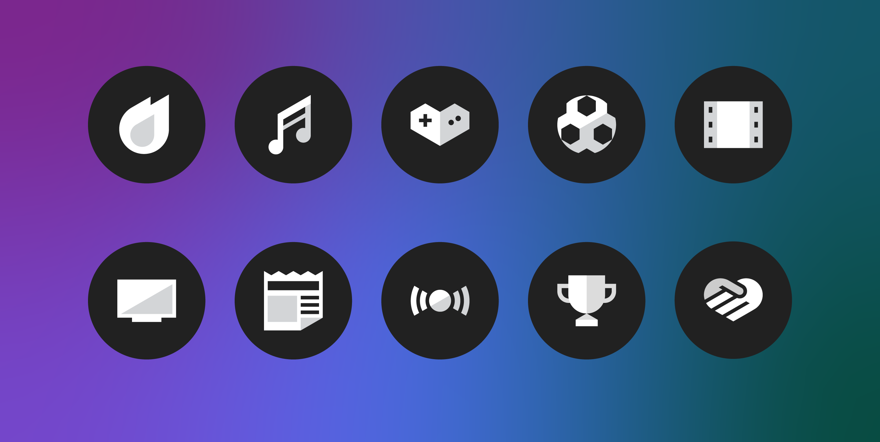
01 — True to form
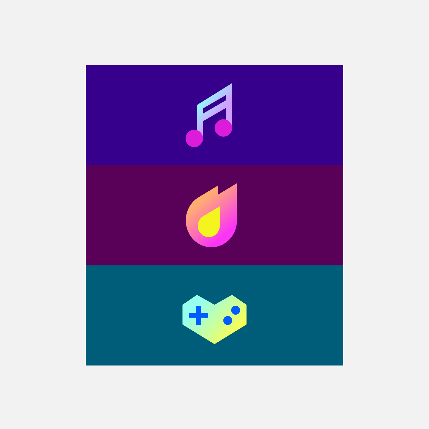
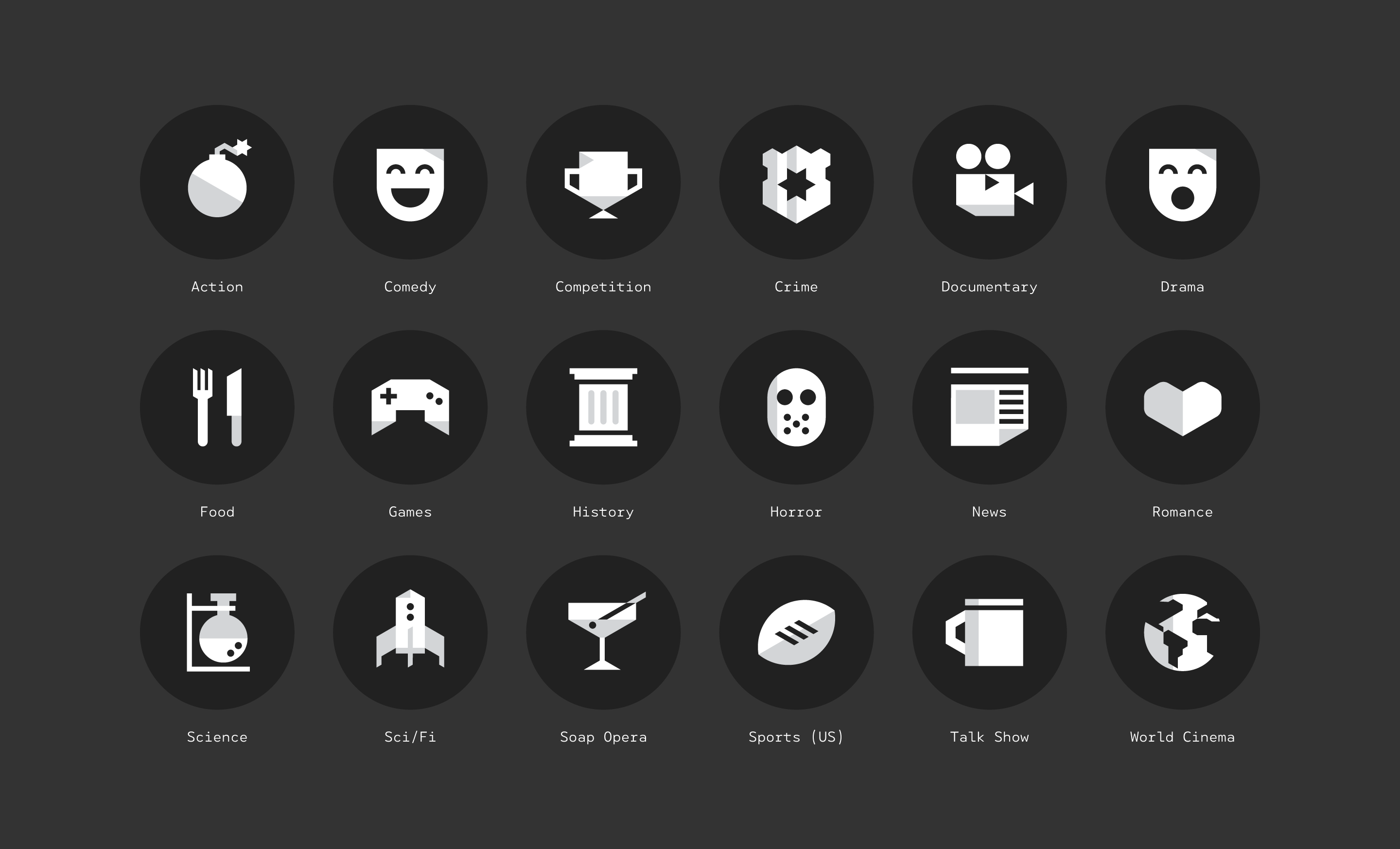
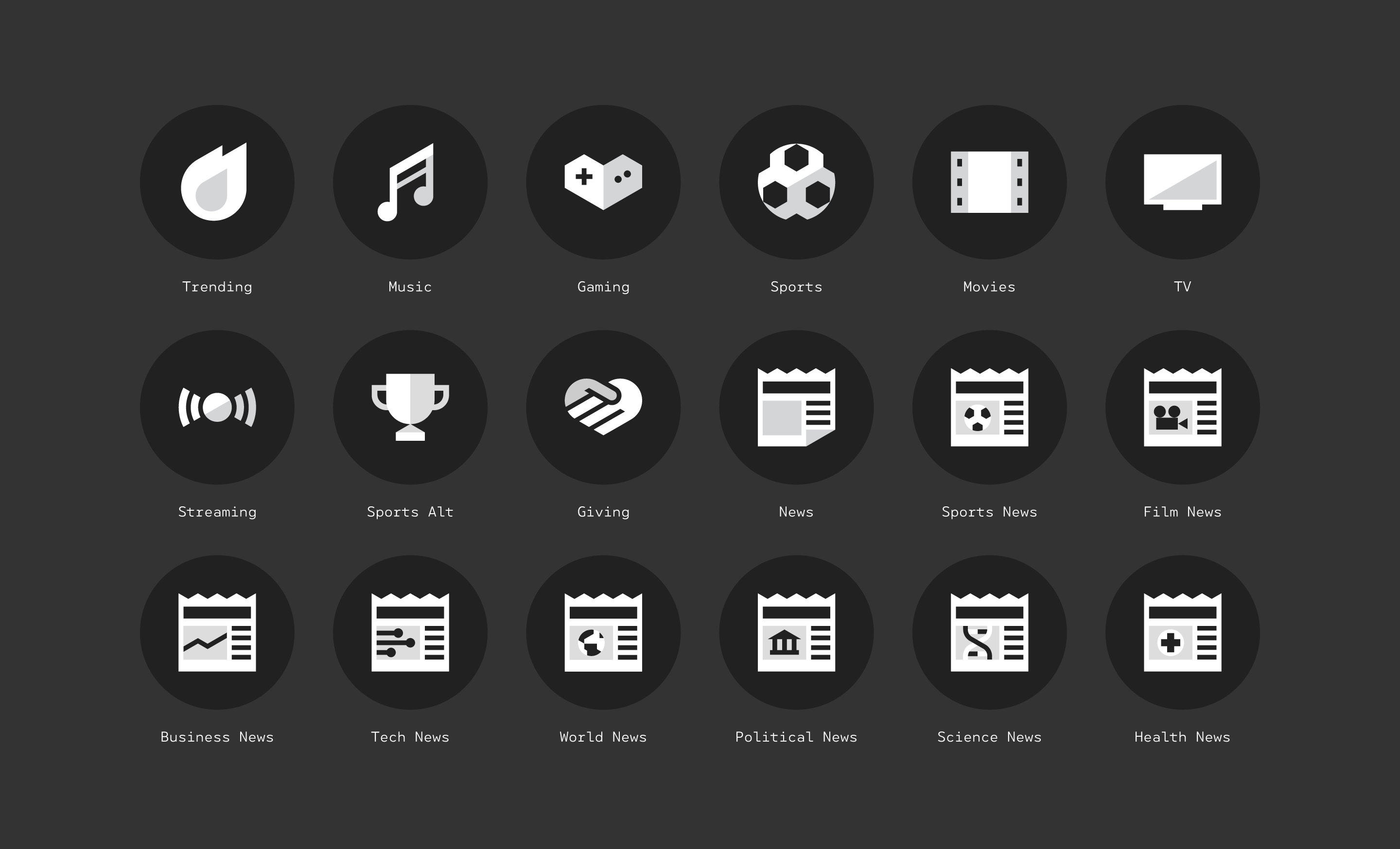
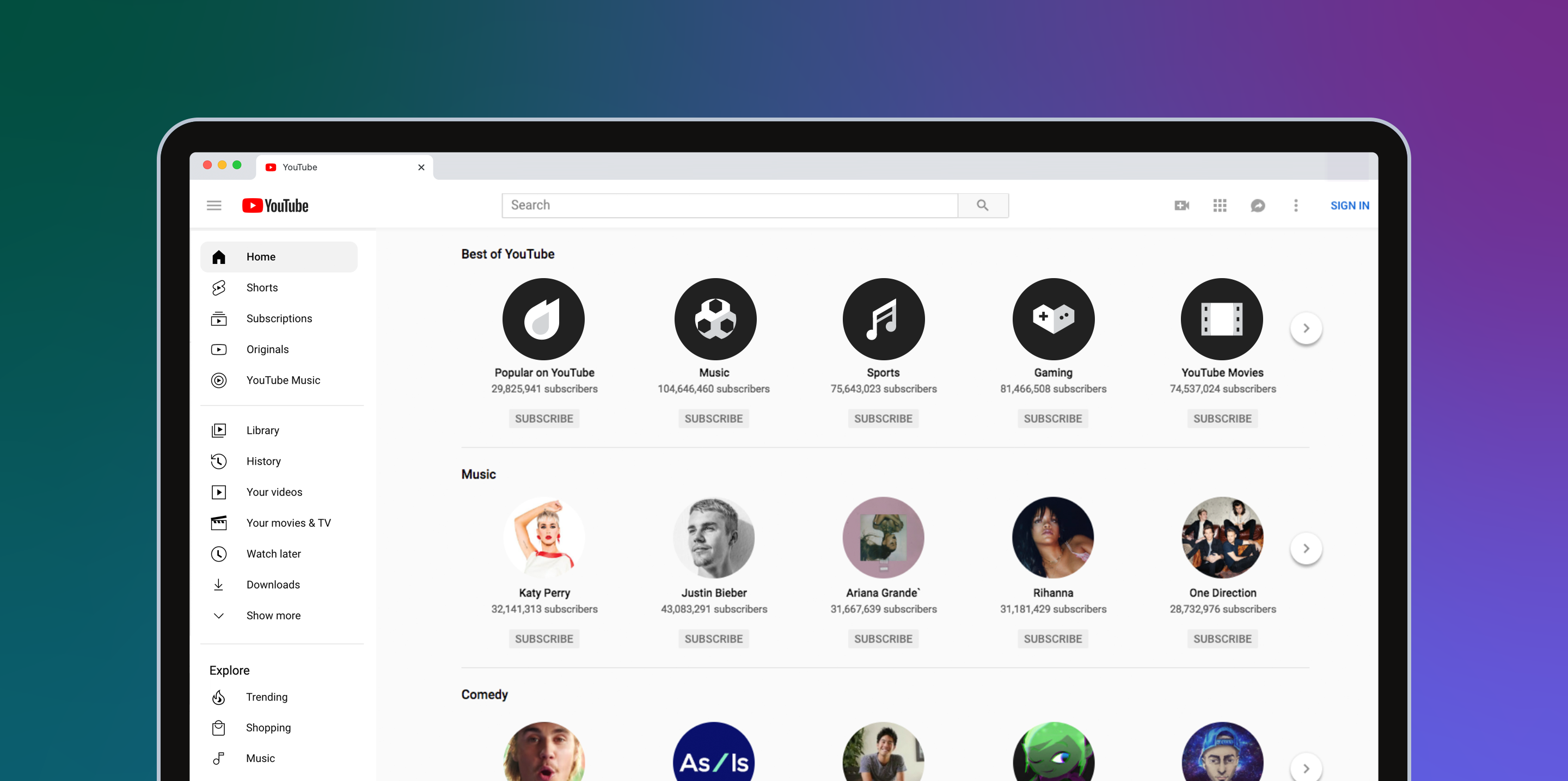
In 2017, I co-designed a set of icons to represent verticals in the YouTube TV app launching that year. Two years later, I refined and adapted the system to apply to YouTube’s house channels which can be accessed from the explore tab of the main app and on desktop.
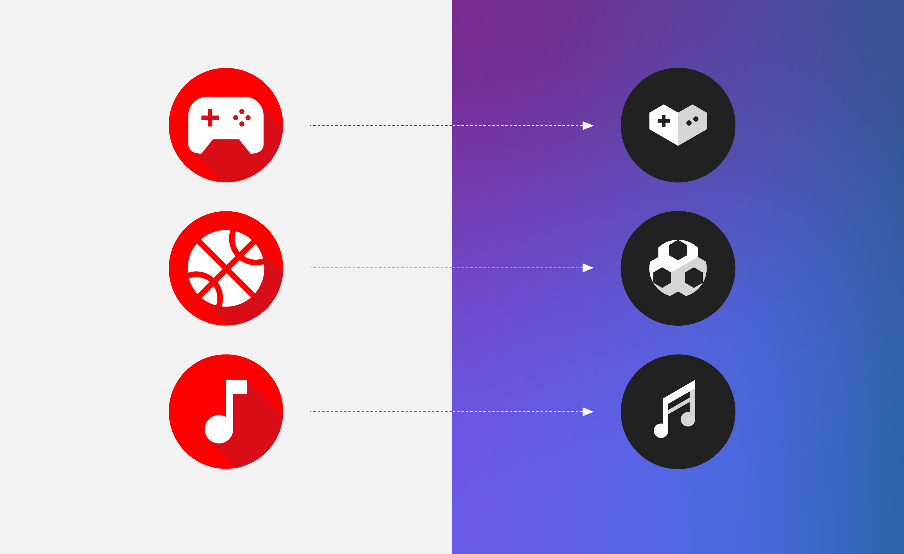
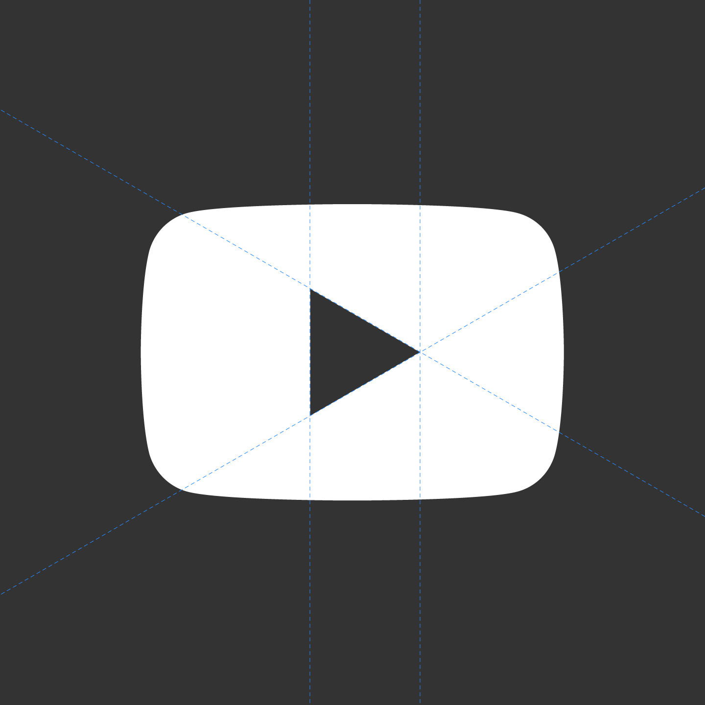
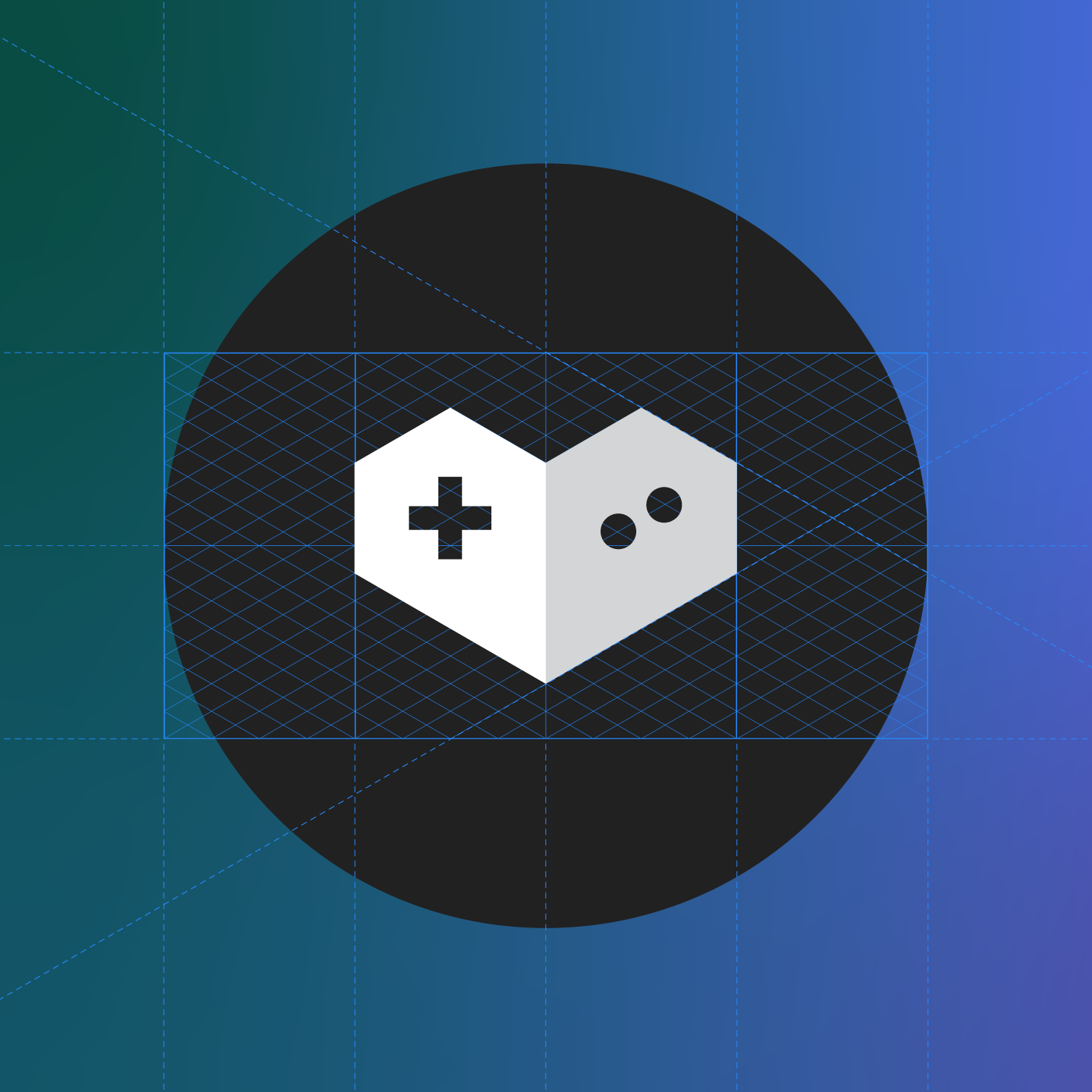
The new icons replaced an older set modeled on Google Material standards and they tied in more closely with YouTube’s brand through the use of an isometric grid inspired by the angles of the play arrow in the YouTube logo.
The new icons replaced an older set modeled on Google Material standards and they tied in more closely with YouTube’s brand through the use of an isometric grid inspired by the angles of the play arrow in the YouTube logo.
![]()
YouTube TV icon set — 2017
![]()
Previous Material icons vs 2019 topic icon update
02 — Legacy
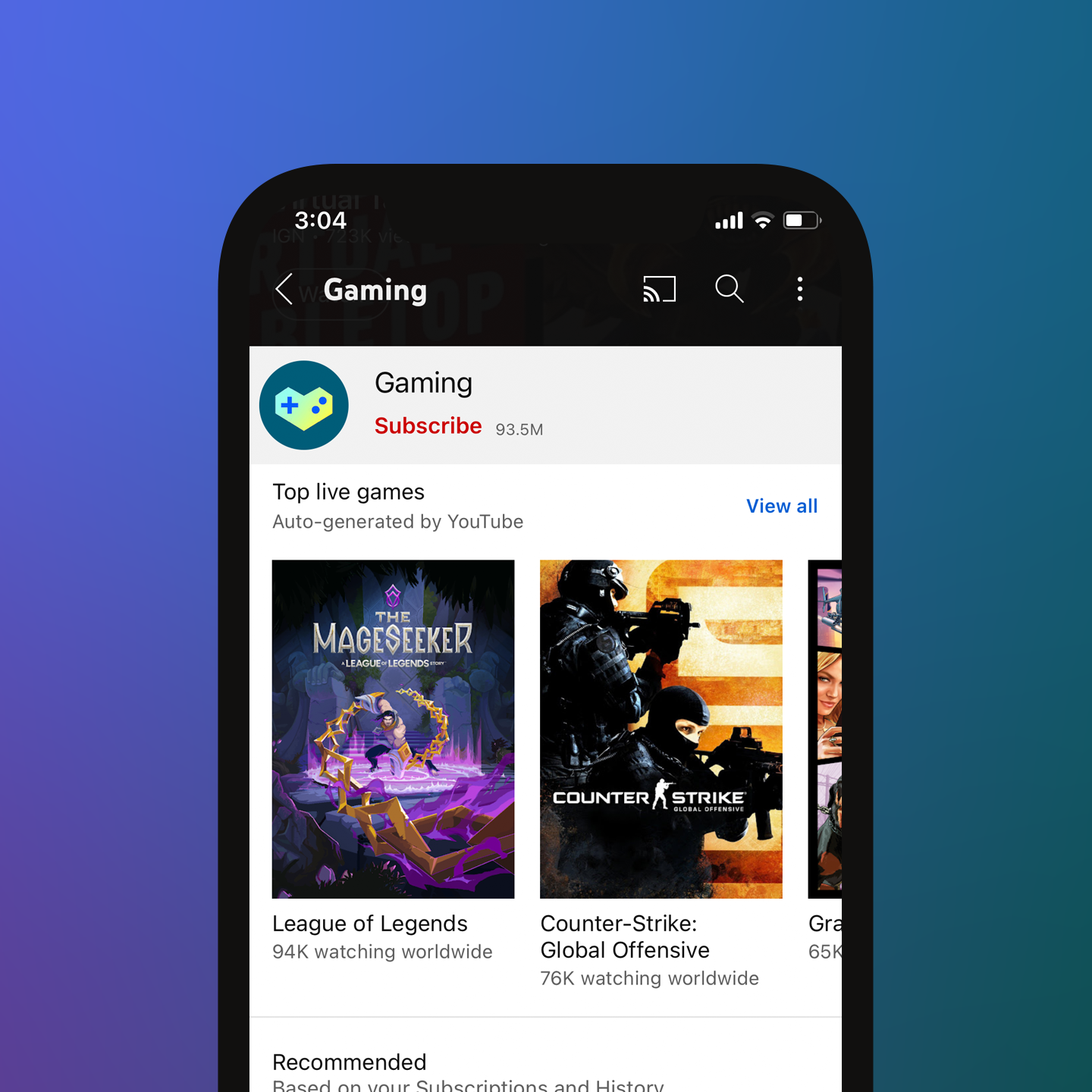
In 2022, I consulted on an update to the topic icons which introduced a brand color and gradient treatment. The set aligns with the symbology used in the system icons while the new styling helps to further distinguish them as their own class within the UI.
