YouTube brand elements
My role
Designer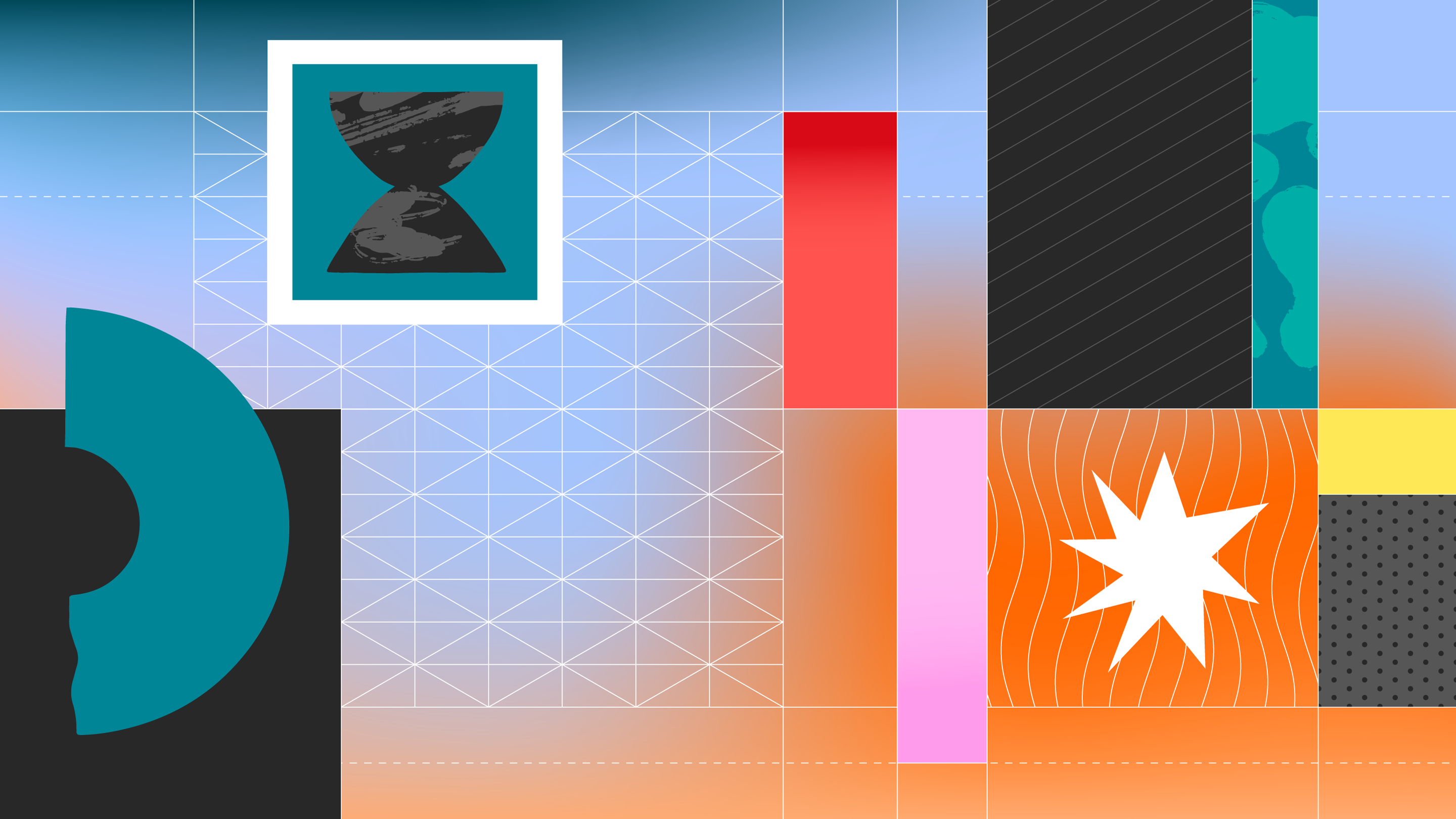
01 — First principles
Since 2015, my team has developed YouTube’s identity across products and marketing. In addition to the core elements — logo, typeface and primary palette — we use a range of secondary elements to bring life and expression to the brand.
Orchestrating all these elements are a set of principles: human, connected, expressive and story-driven. I helped to define an early version of these principles through my work on the illustration system. In particular, human and story-driven were important to me as key differentiators.
Orchestrating all these elements are a set of principles: human, connected, expressive and story-driven. I helped to define an early version of these principles through my work on the illustration system. In particular, human and story-driven were important to me as key differentiators.
Although “human” may be an overused attribute in branding, YouTube has a strong claim to it. The bulk of the platform’s content is created by amateurs and its power derives from its directness and lack of polish. I felt it was important for the brand to reflect these qualities.

Video is an inherently narrative medium. Every frame is transitory. I felt this could be reflected in the branding even through static graphics by employing imagery that suggests a story or, more abstractly, through compositions with an implied sense of motion.
02 — In living color
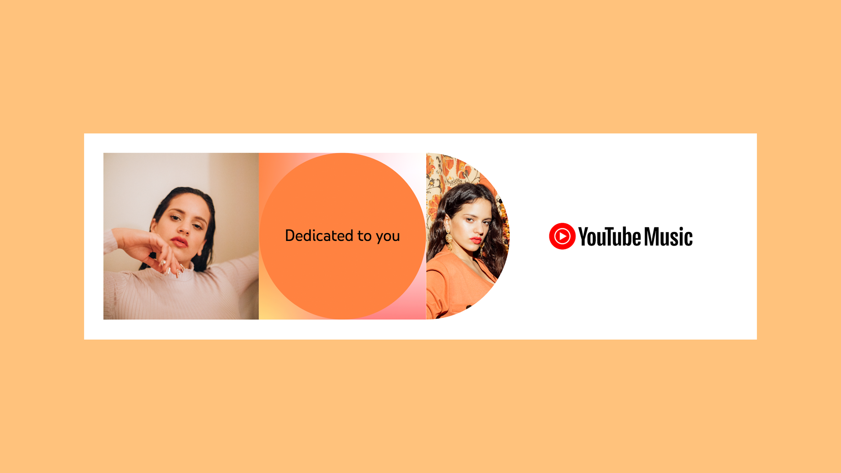
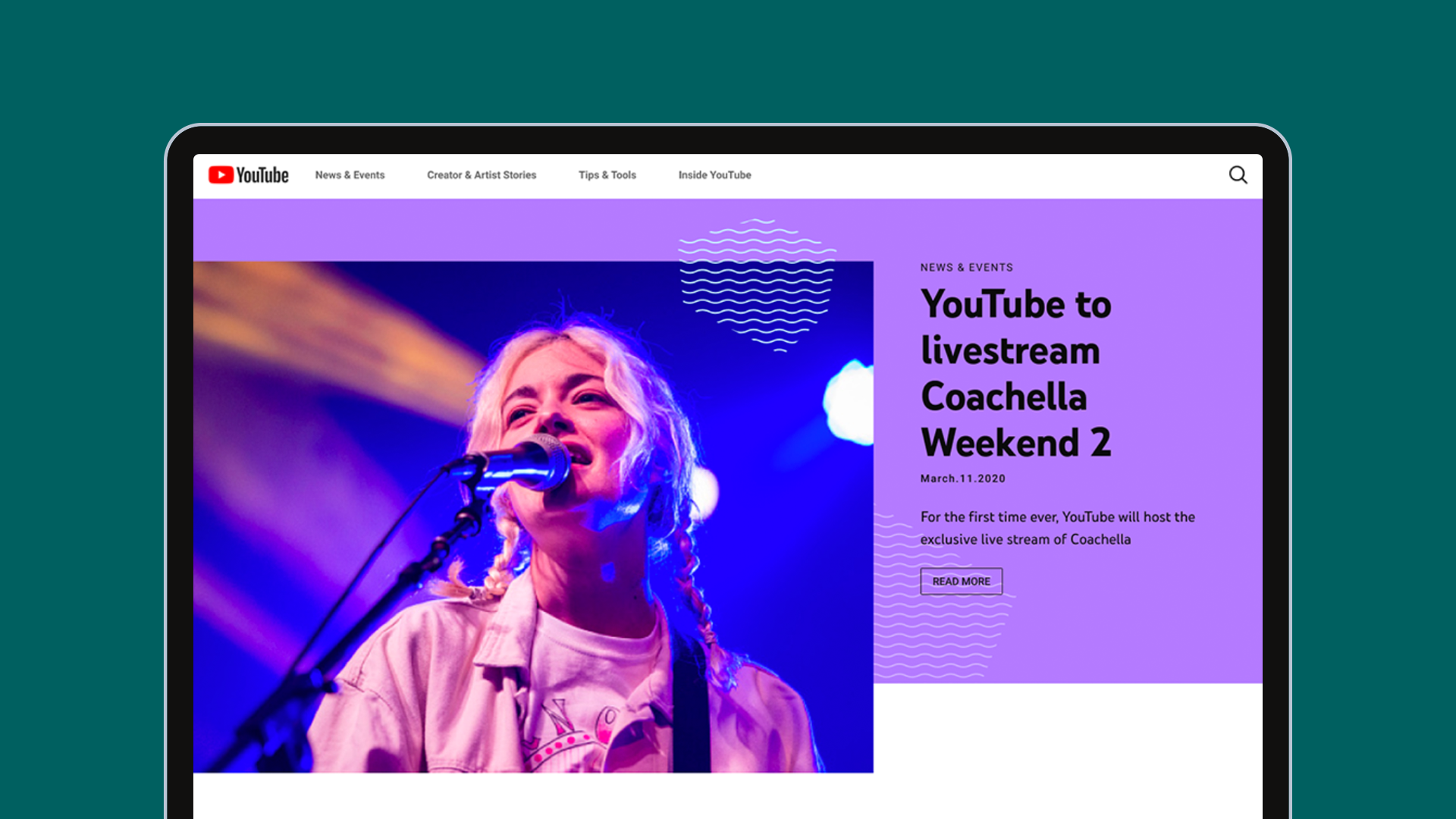
YouTube is more than red. For the 2017 launch of YouTube’s first brand system, I created a secondary palette which used the core brand red as its keystone but which empowered the brand to better express the vibrancy and diversity of its content. Over the years, the palette has been further expanded and refined in the service of this idea.
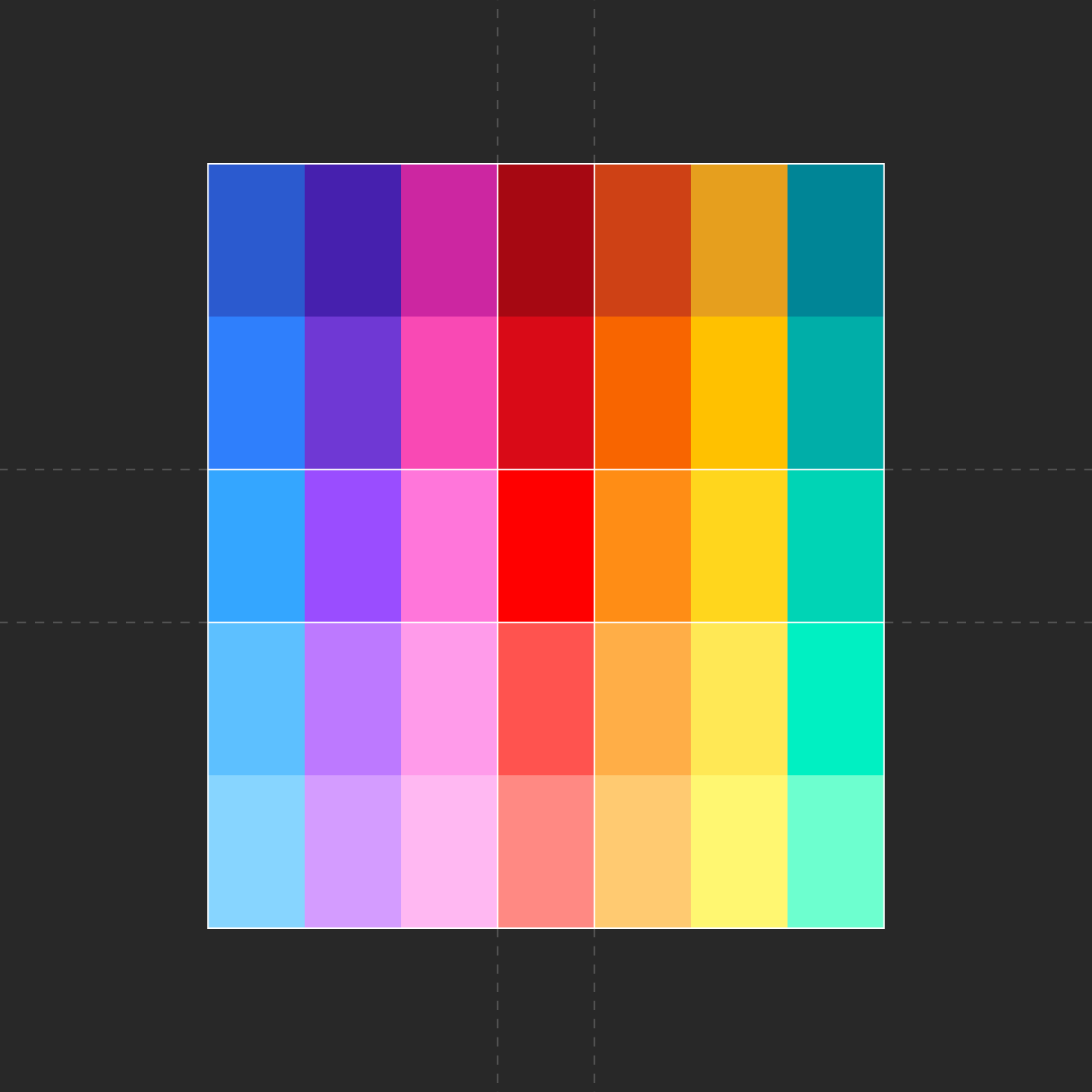

Palette; application example — Robyn Lee
Palette; application example — Robyn Lee
03 — Pattern play
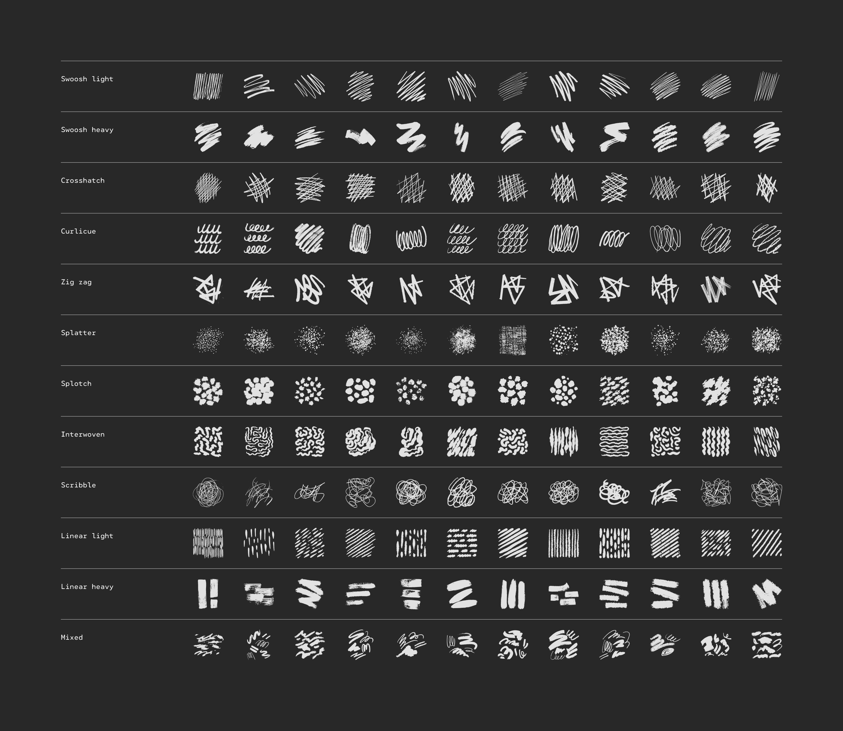
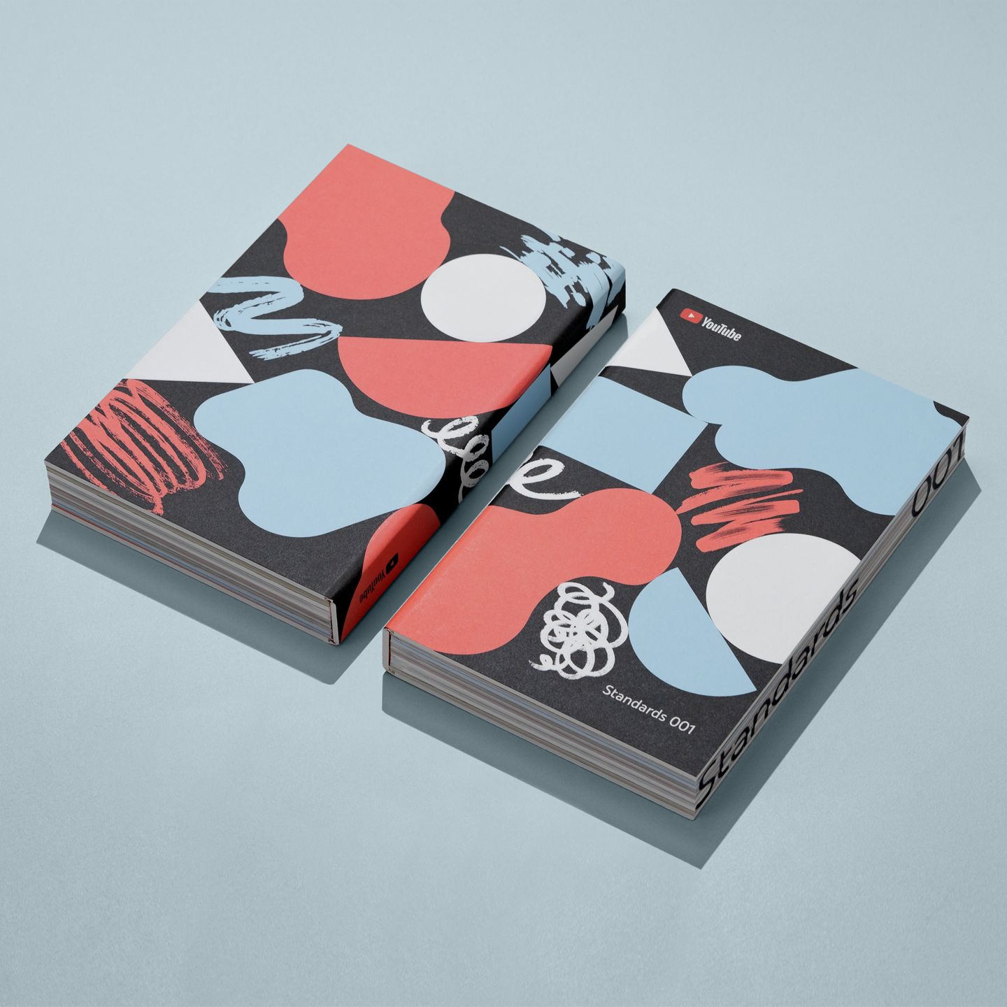
YouTube’s first brand system included a limited set of patterns which were based upon an isometric grid, in reference to the angles of the play arrow. I expanded this initial set into an open-ended system with an emphasis on diverse weights and styles in order to serve a range of brand expressions.
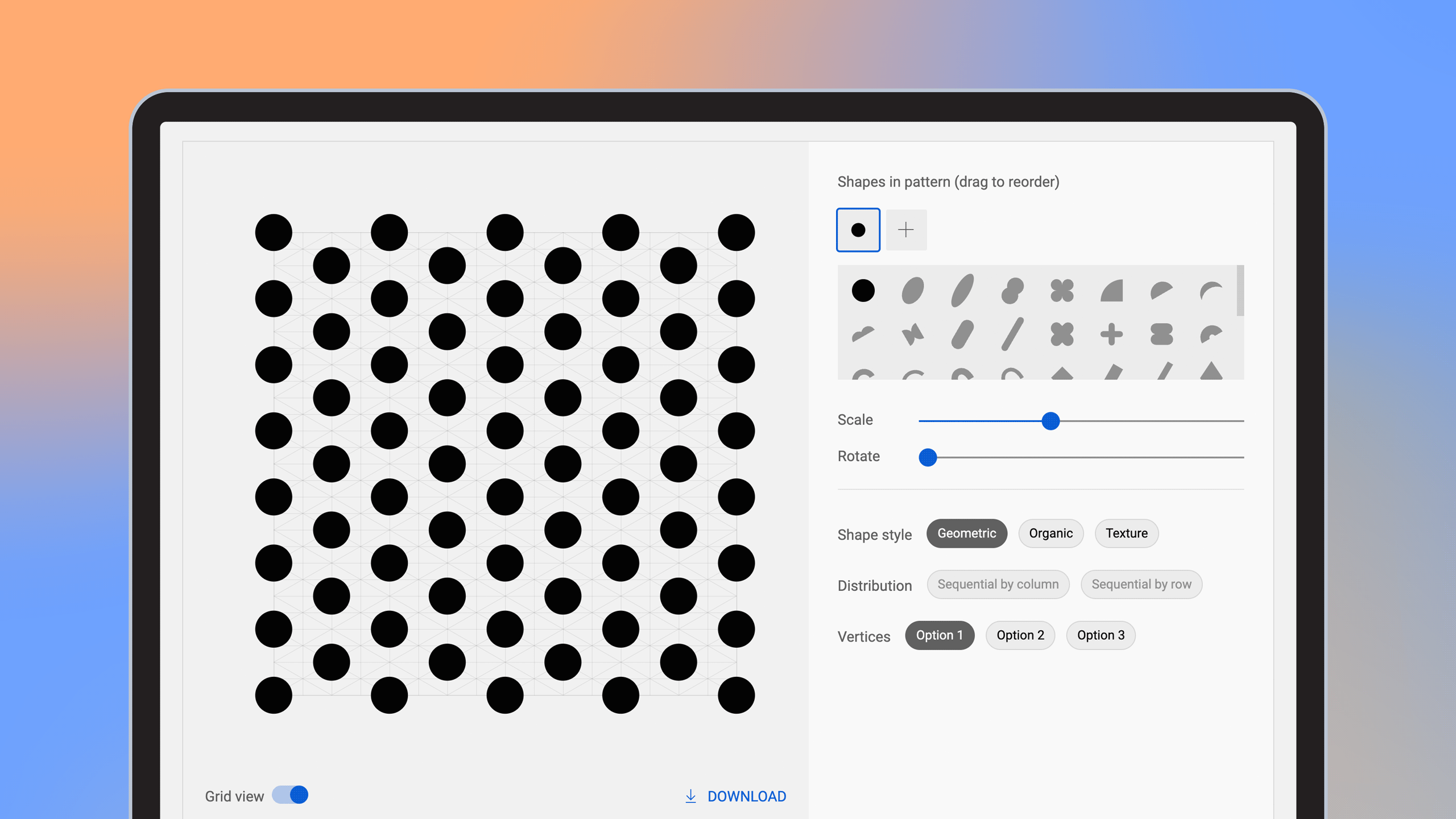
I collaborated with a UX engineer and several other designers to develop a proprietary pattern generation tool which allows anyone to create a unique on-brand pattern within seconds.
I collaborated with a UX engineer and several other designers to develop a proprietary pattern generation tool which allows anyone to create a unique on-brand pattern within seconds.

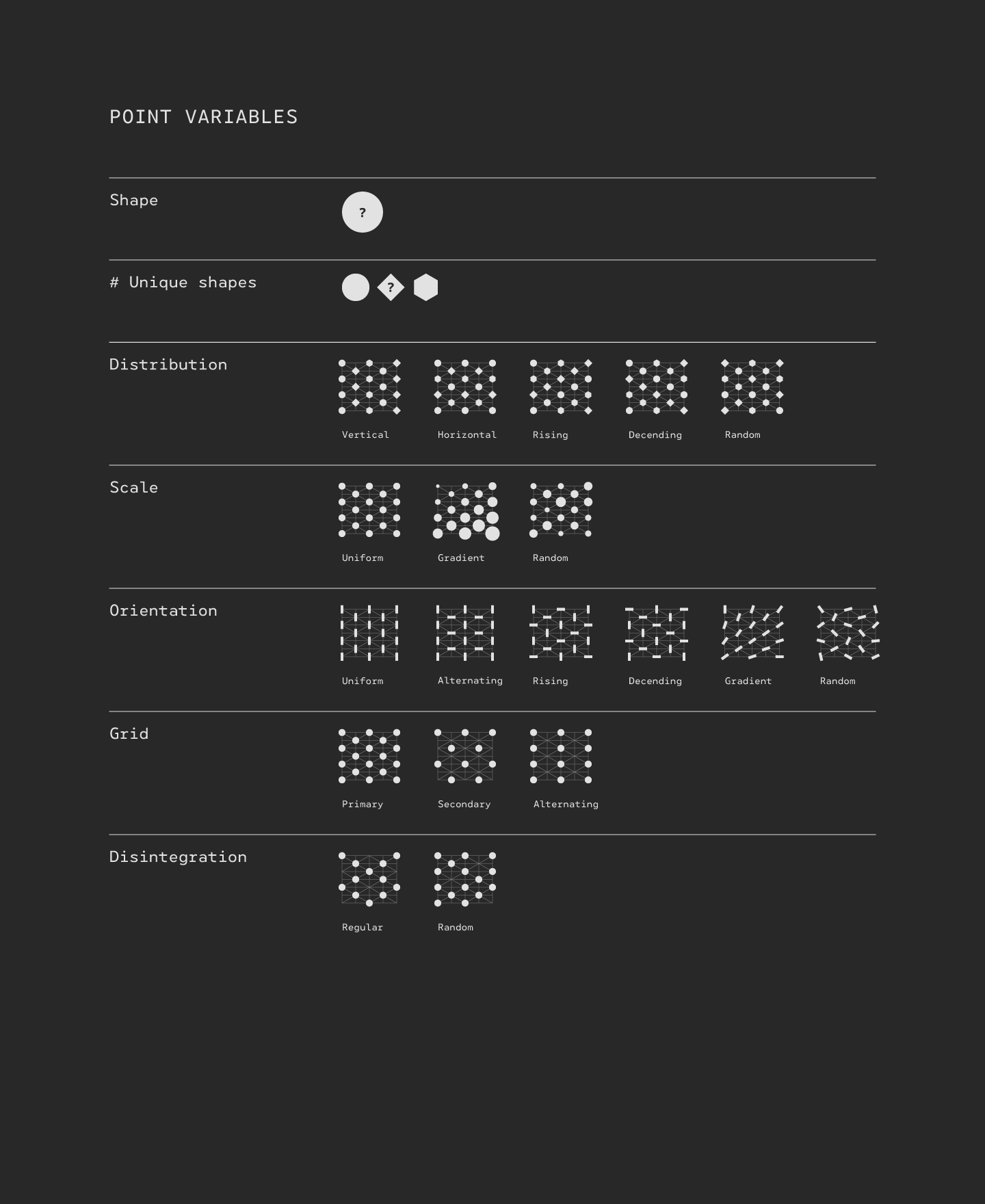
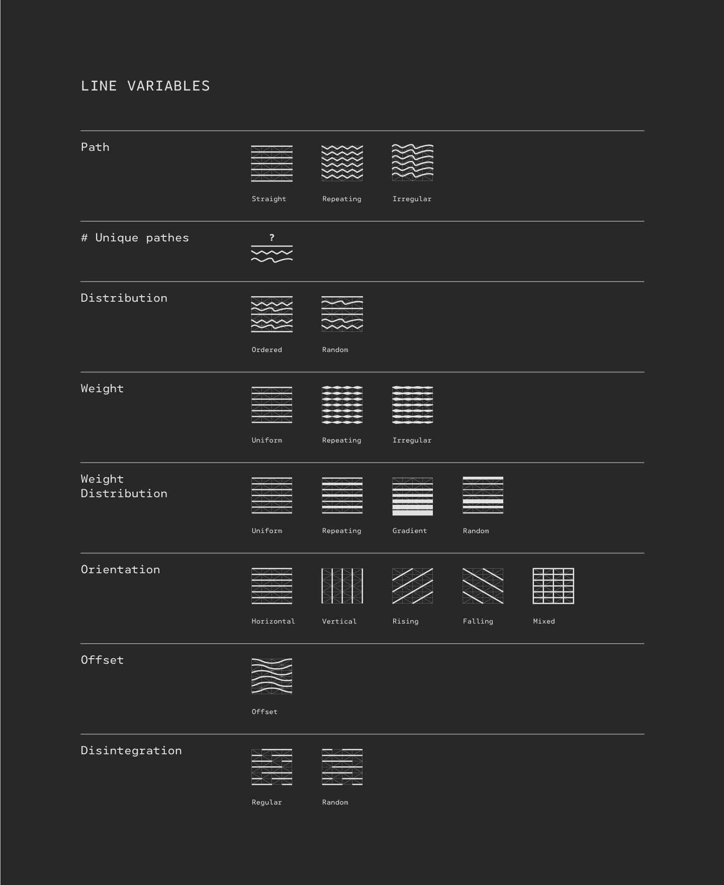
Pattern variables exploration
![]()
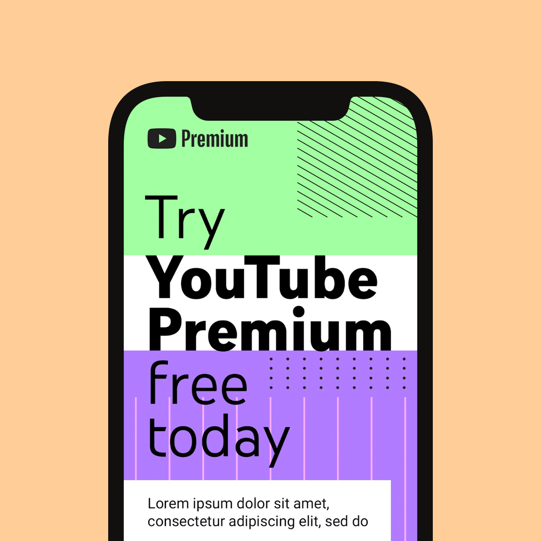
Pattern generation tool
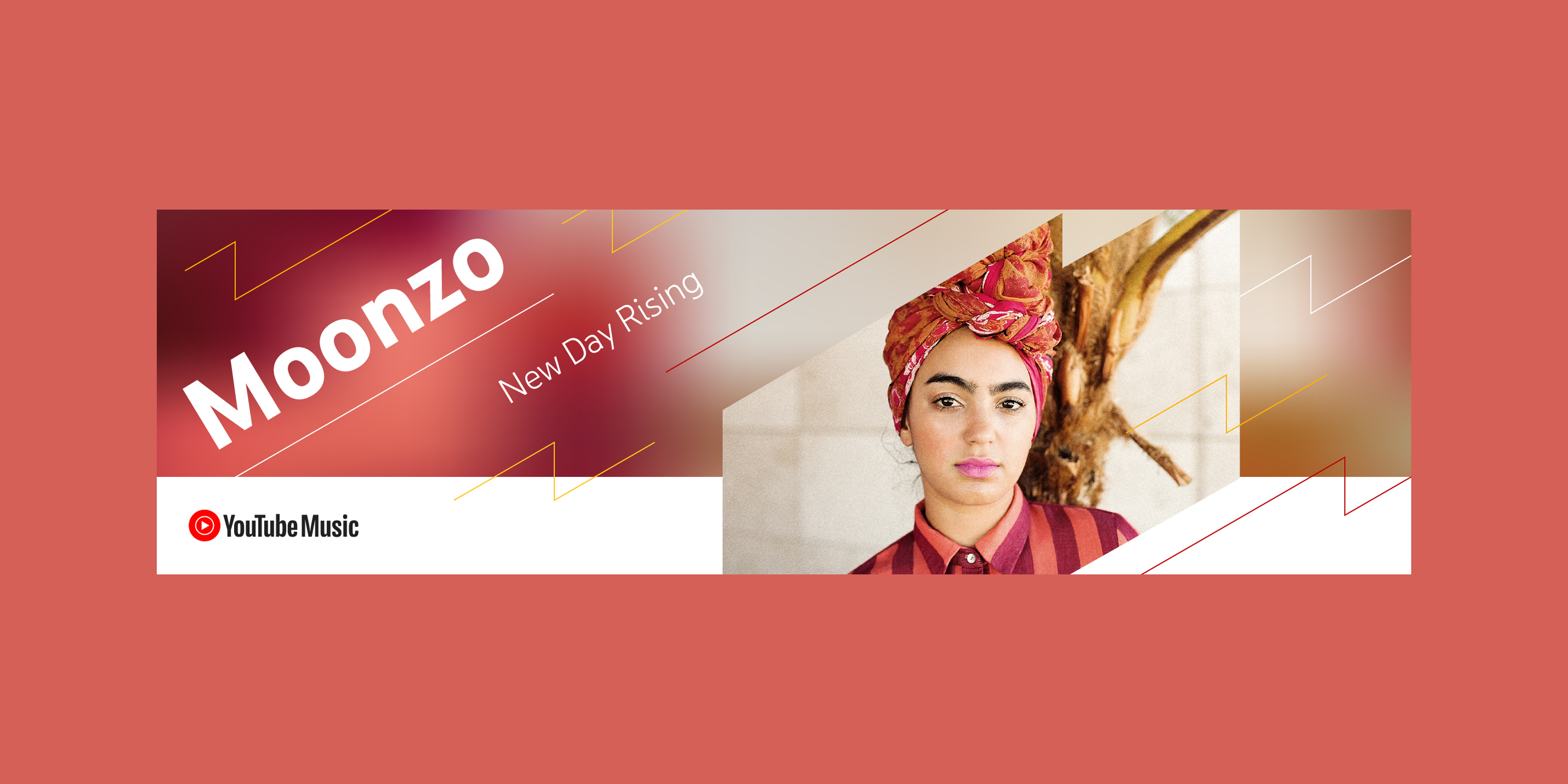
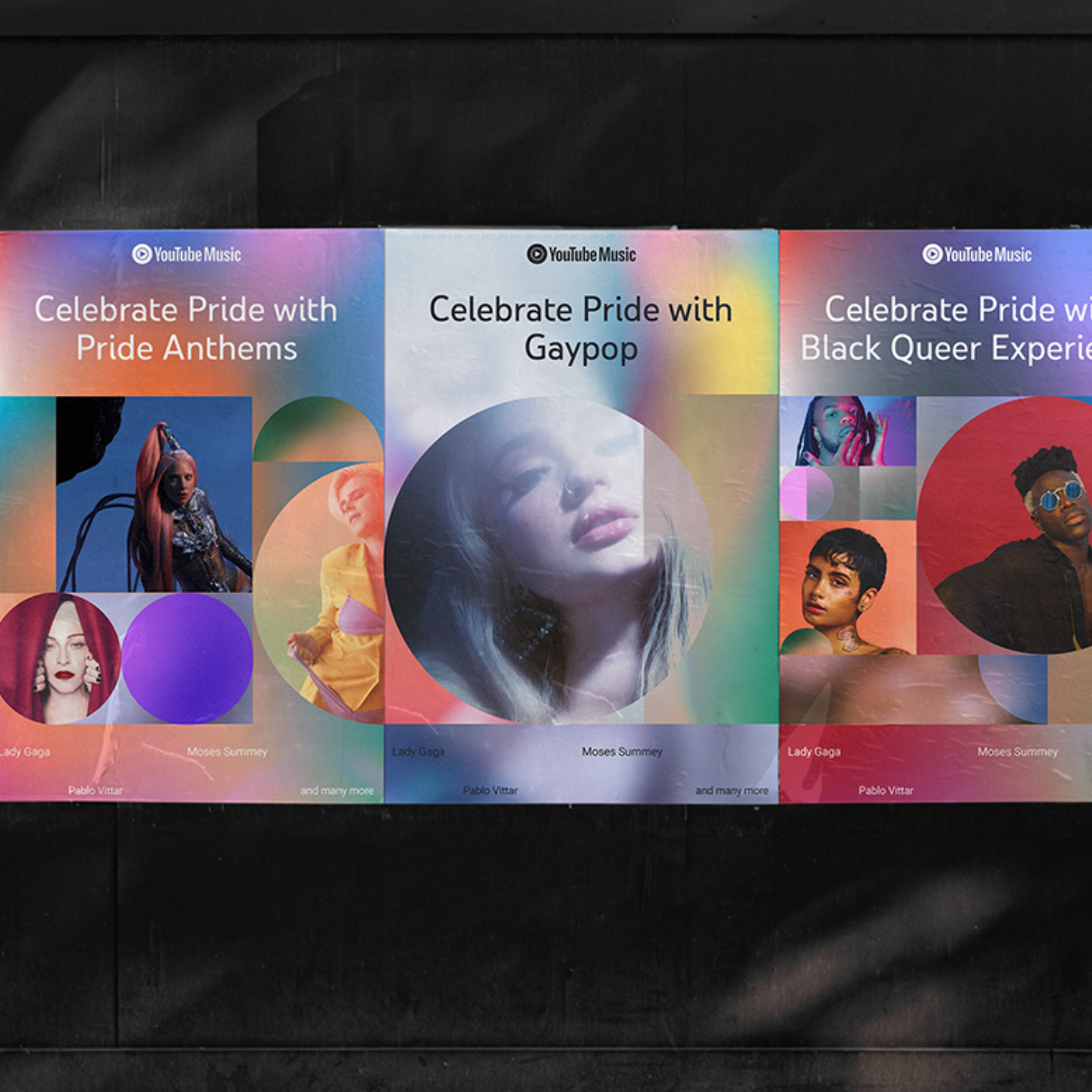
Pattern usage examples — various designers
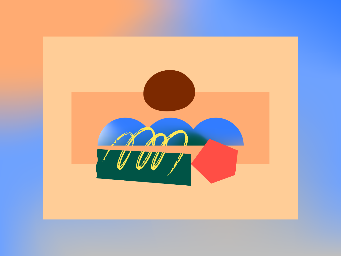
04 — Textural touches
Along with the expansion of patterns, I introduced the use of non-repeating textures into the design system. Used as both shape fills and free-floating marks, these function as a counterpoint to the grid-based patterns and bring a human touch and sense of motion to our compositions.
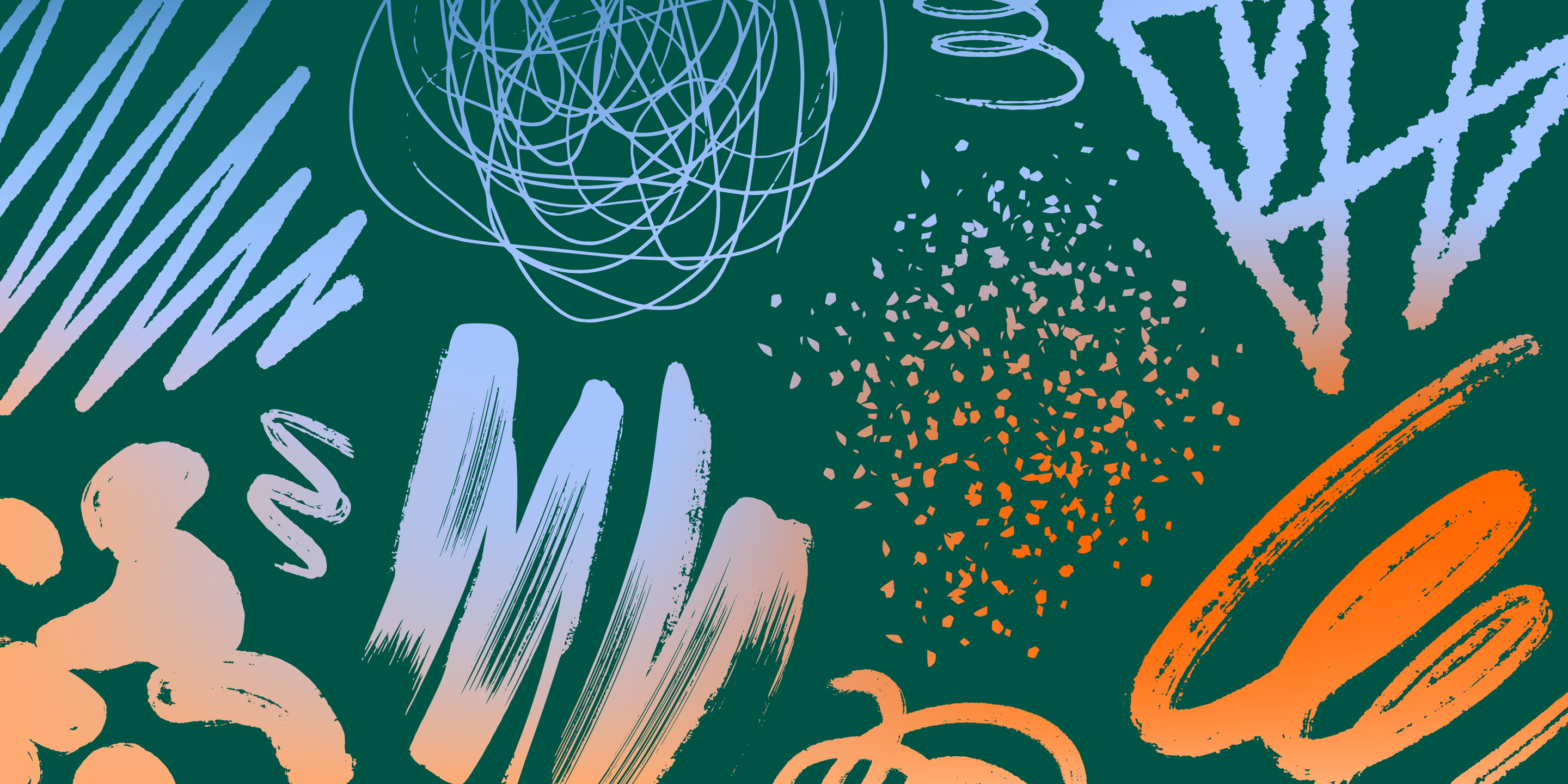
Texture library
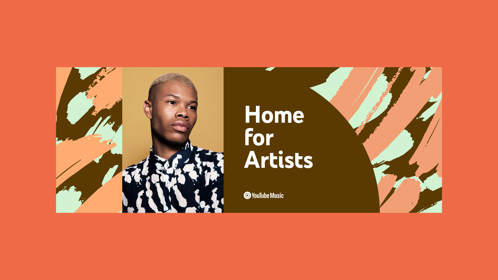
Texture usage examples — various designers
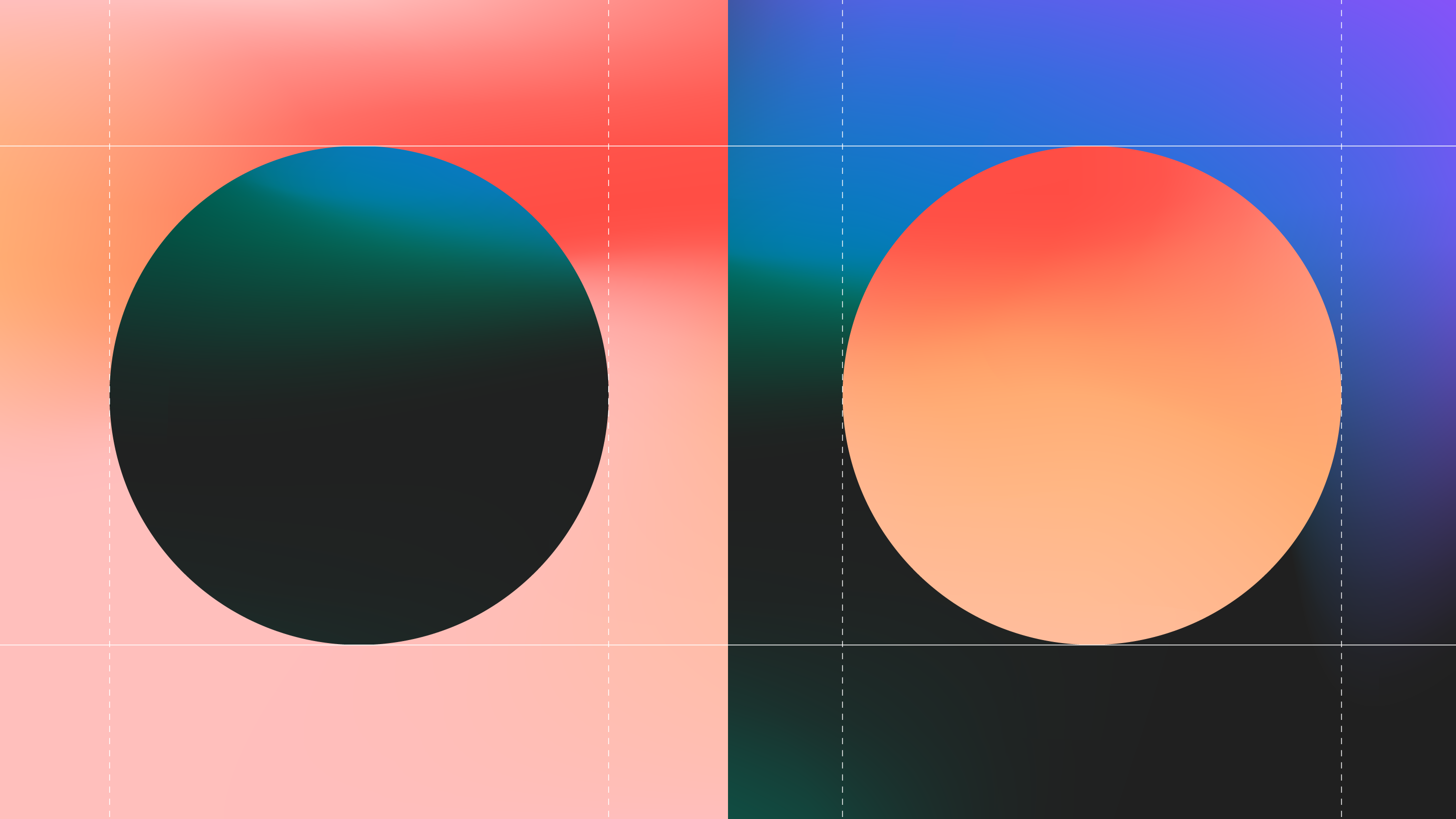
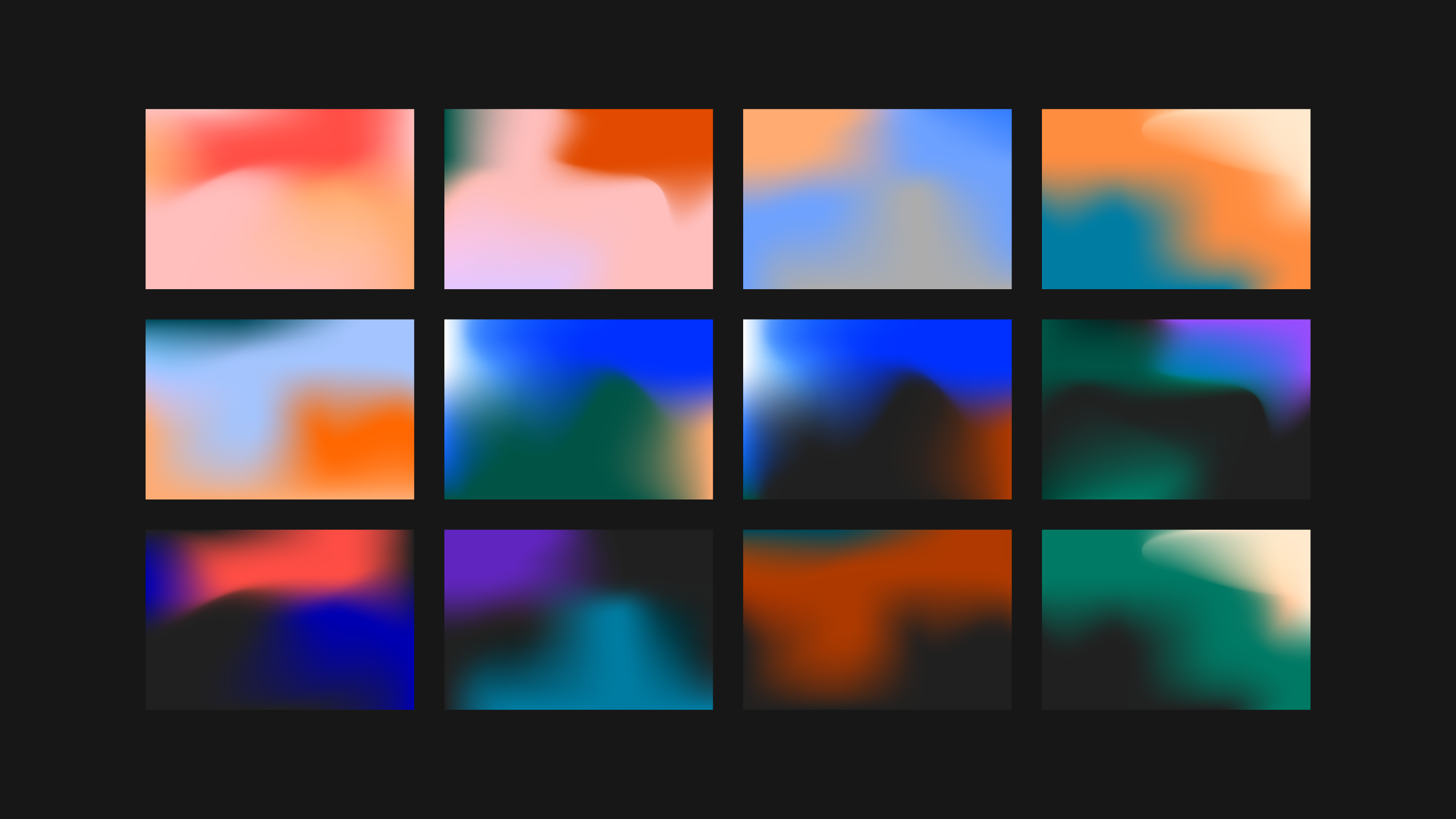
05 — Natural gradients
My team liked the idea of using gradients as a metaphor for the blending of communities across the platform but there was a question of how to do this in a way that would differentiate it from the severe and artificial treatments seen elsewhere. I explored a more natural, fluid approach which set the template for the team’s direction.